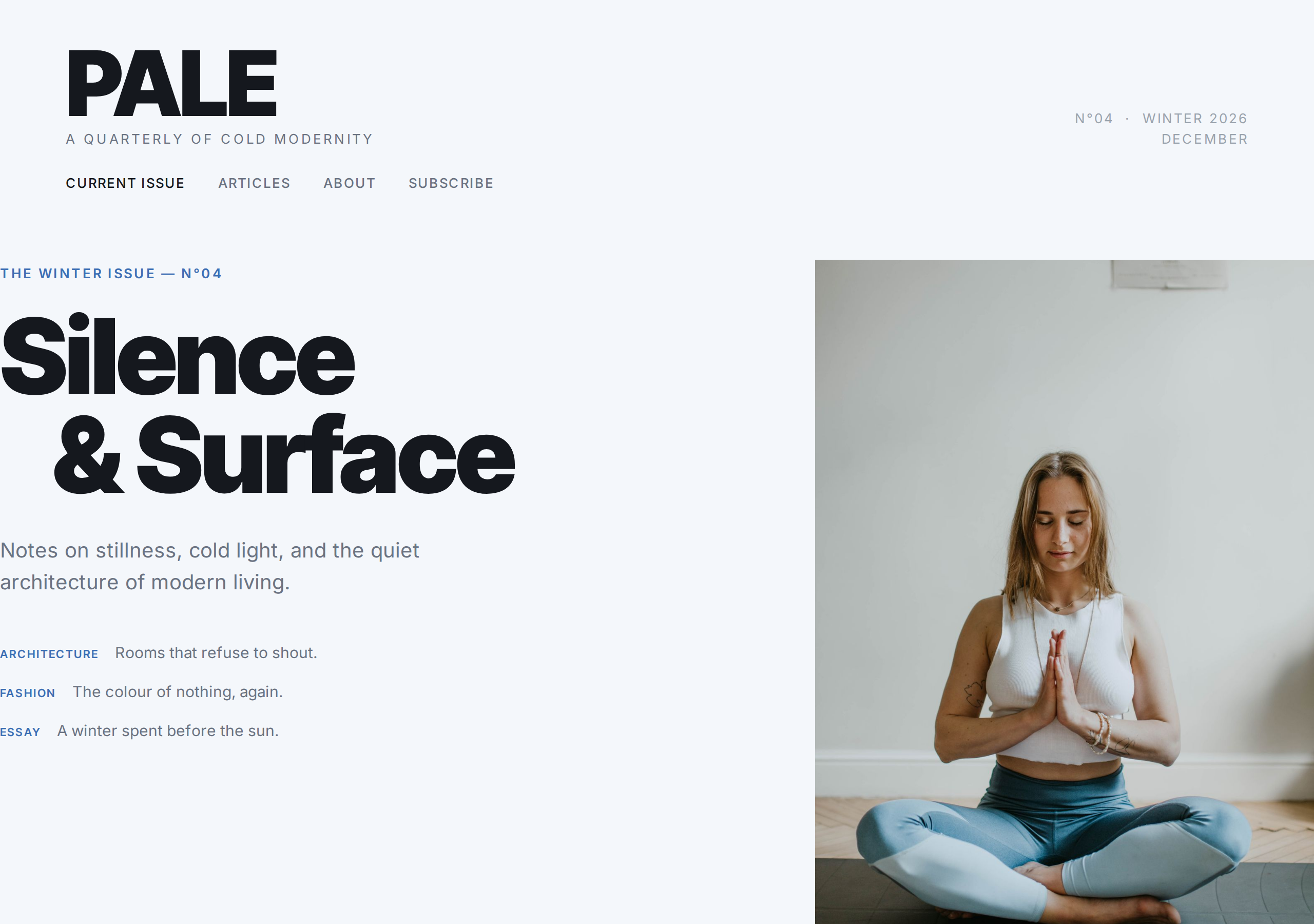
PALE is a magazine-editorial Astro theme built for digital quarterlies, design publications, and anyone who treats layout as part of the story. The design language is cold modernity — think Wix Editorial, Monocle, and the early web magazines that borrowed print conventions because they worked.
This is not a blog theme with a magazine skin. Every layout decision — the multi-column body, the drop caps, the pull quotes that interrupt the reading flow, the full-bleed plates — exists because print magazines spent a century refining them. PALE brings that refinement to static HTML that loads in milliseconds.
Layout System
PALE ships with three distinct feature openers, each serving a different editorial purpose:
- Text-led opener — Running head + folio number, oversized headline, deck, byline, then a two-column body with a drop cap on the first paragraph. Image sits below the text, the way a magazine spread reads.
- Image-led opener — Full-width image first, then the headline and body. For stories where the visual is the lede.
- Centered essay — Single narrow column (680px), centered headline, intimate reading experience. For personal essays and opinion pieces.
Beyond the openers, the long-read section combines two-column body text with a pull quote that breaks across columns — no box, no border, just large type that stops the eye mid-scroll.
Editorial Furniture
Every section carries print-magazine furniture that orients the reader:
- Nameplate masthead — Brand wordmark, tagline, issue number, and date in the header
- Running heads — Category label (Architecture, Fashion, Essay) above each section
- Folio numbers — Section numbering (01, 02, 03…) in the top-right
- Kickers — Small uppercase labels above cover headlines
- Coverlines — Table-of-contents teasers on the cover grid
These aren’t decorative. They’re wayfinding — the same navigational logic that print magazines use to help readers understand where they are and what comes next.
Typography & Color
- Inter Tight for display — a condensed, high-contrast sans-serif that carries the cold-modern tone. Used for mastheads, headlines, pull quotes, and folio numbers at weights 500–900
- Inter for body — 16.5px at 1.7 line height in two-column layout, 18px at 1.78 in single-column essays. Tuned for sustained multi-paragraph reading
- Cold palette — Paper white (#F4F7FB) with a faint blue cast, near-black ink (#15181E), muted secondary text (#6B7382), and a single editorial blue accent (#3D6FB4) used on kickers, links, and drop caps
No warm tones, no gradients, no decorative shadows. The color system is intentionally restrained — the photographs and typography carry the visual weight.
Pages
- 18 production-ready pages: Cover, 3 feature articles (text-led, image-led, essay), long read with pull quote, full-bleed plate, archive grid, About, Contact, Subscribe, Privacy, Terms, 404
- Cover page with cover grid: headline + deck + coverlines + hero image
- Archive section with staggered card offsets — each past issue card sits at a different vertical position, breaking the grid for visual rhythm
- Full-bleed plate — edge-to-edge image section with caption, the visual peak of the issue
Content Management
Like Margin, PALE uses Astro content collections. Write articles as Markdown files with frontmatter for category, author, featured image, and layout type. The theme handles the rest — drop caps, column breaks, pull quotes, and folio numbering are applied automatically based on frontmatter.
Responsive Behavior
On tablet and mobile, multi-column layouts collapse to single column, drop caps scale down proportionally, full-bleed plates reduce to 50vh, and the archive grid stacks vertically. Every breakpoint (900px, 768px, 560px, 400px) has been hand-tuned — not auto-generated — to preserve the editorial feel at every size.
SEO & Performance
- Zero JavaScript — pure static HTML, loads in milliseconds
- Auto-generated sitemap covering every page and article
- Canonical URLs and Open Graph metadata on every page
- Article JSON-LD structured data for search engines
- robots.txt and llms.txt for crawling and AI discoverability
- RSS feed for issue-based publications